Shannon Trust: Turning Pages
.png)
Overview
Deliverables
Outcome
External link

.png)
.png)

My Role
UX/UI Design
Accessibility-Focused Product Design
Responsive Design
User Testing Collaboration
Design Iteration & Experience Enhancement
I worked closely with project managers and development teams to transform existing user journeys into more accessible and intuitive experiences. The project relied heavily on feedback collected from facilitators and coaches, which helped identify usability pain points and guide design improvements within tight time and delivery constraints.
The Challenge
Designing for prison learners introduced a unique set of accessibility and emotional challenges that extended far beyond traditional educational UX.
The learners:
- had varying literacy levels
- were unfamiliar with digital products
- required simplified interaction patterns
- rejected overly colorful or playful interfaces
- responded negatively to childlike illustrations and messaging
Additionally, direct access to learners for usability testing was not possible due to prison restrictions. Feedback had to be collected indirectly through facilitators and coaches working closely with the learners.
This required balancing:
- accessibility
- emotional sensitivity
- usability
- technical limitations
- delivery timelines
- and stakeholder constraints
while still creating an experience that felt supportive, clear, and engaging.
Designing for Low-Literacy Users
One of the primary goals of the redesign was reducing cognitive friction for learners interacting with the platform.
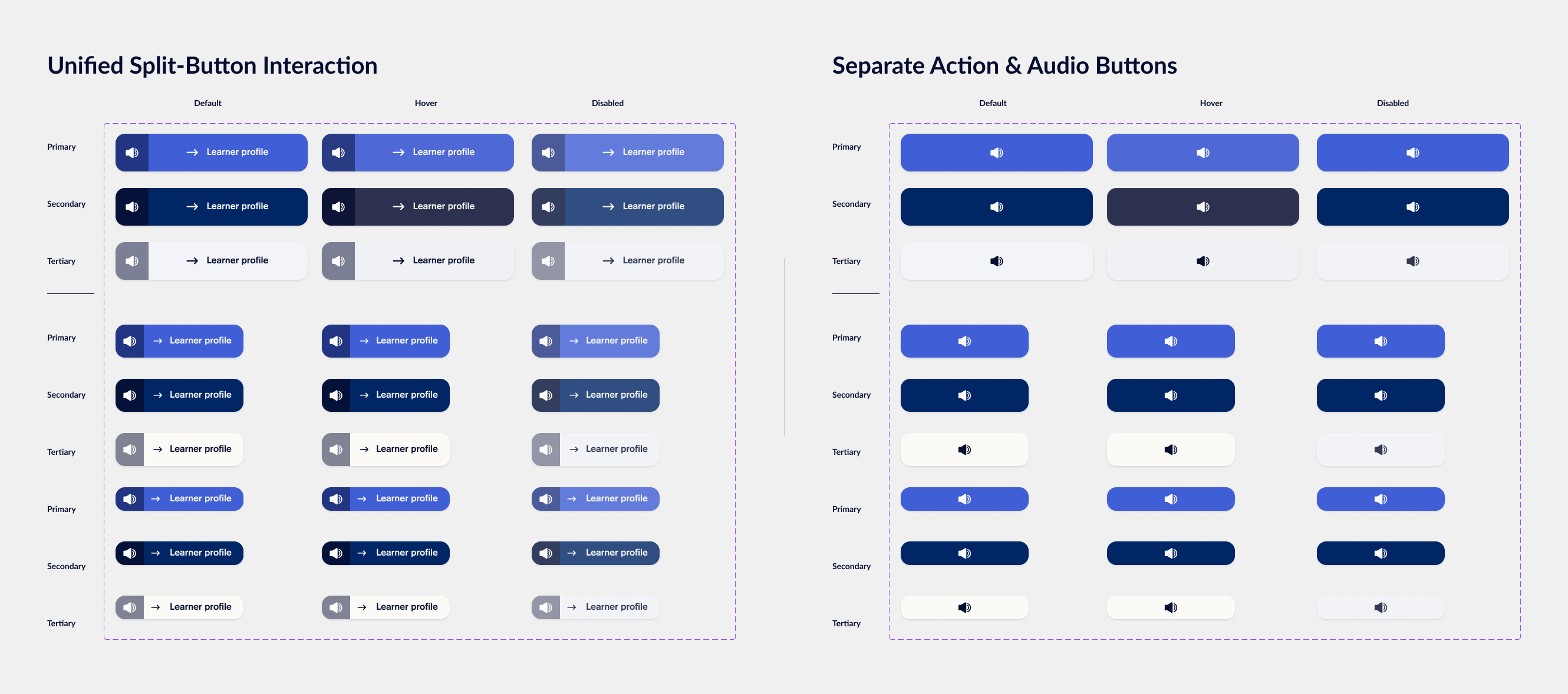
The original experience separated actions into two distinct buttons:
- one button to perform the action
- another button to hear the label read aloud
This created confusion and increased interaction complexity for users with limited reading abilities.
UX Improvement — Split Action Button
To simplify the experience, I redesigned the interaction into a single split-button component:
- the left side provided audio support
- the right side triggered the primary action
This reduced cognitive overhead while preserving accessibility support for learners who relied on audio cues.
Creating Guided Learning Journeys
Another major challenge was helping learners understand:
- where they currently were
- what they had completed
- and what would happen next
Rather than presenting exercises as isolated screens, I redesigned the learning flow into a guided step-by-step journey that provided a stronger sense of progression and orientation.
The goal was to make the experience feel motivating and structured without relying on excessive gamification or distracting visuals.
Visual Restraint as a UX Decision
One of the most important insights from facilitators and coaches was that learners strongly rejected interfaces that felt childish or overly playful.
Bright colors, decorative illustrations, and celebratory messaging created discomfort and disengagement for many users.
Instead of relying on visual stimulation, I intentionally shifted the interface toward:
- calmer visual hierarchy
- simplified layouts
- icon-based communication
- restrained use of color
- minimal illustration usage
- clearer typography and spacing
Even microcopy required careful consideration. For example, highly celebratory messages such as “Hooray! You did it!” were avoided in favor of more neutral and respectful communication patterns.
This helped create an experience that felt supportive and dignified rather than patronizing.
Supporting Facilitators & Coaches
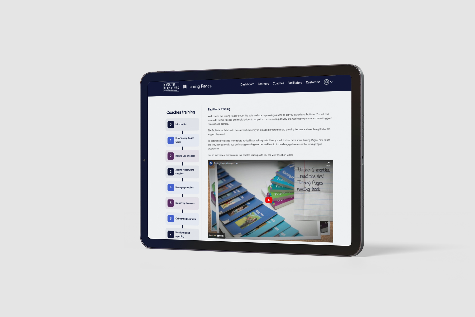
In addition to learner-focused improvements, I also worked on experiences for facilitators and coaches who needed onboarding support while using the platform.
To improve adoption and reduce confusion, I designed an onboarding flow that introduced platform functionality step-by-step and provided persistent access to guidance materials directly from the user profile area.
This reduced dependency on external support while helping users navigate the platform more confidently.

Working Within Real-World Constraints
This project required making practical UX decisions within multiple constraints:
- limited access to end users
- indirect research through facilitators and coaches
- accessibility requirements
- emotional sensitivity
- strict timelines and delivery expectations
- development feasibility and cost considerations
Rather than designing idealized solutions, the process focused on identifying improvements that could realistically deliver the greatest usability impact within the available scope.